You might have grasped the sarcastic tone in the title. If not...I was being sarcastic - an ugly trait I know, but when you're out shopping and at every turn faced with the option of buying a product with either the Union Jack, the Queen's face or that dreadful Olympic logo on it all gets a bit tiresome.
This blog won't go nearly as far as Charlie Brooker's opinions on Olympic sponsorship (if you haven't read it, you should... www.guardian.co.uk/commentisfree/2012/apr/22/olympics-thank-god-for-sponsors )
I won't be as judgemental as Mr Brooker as whilst I'm getting very bored, very quickly of being British I do think there are some companies out there doing it justice.
1. Marmite
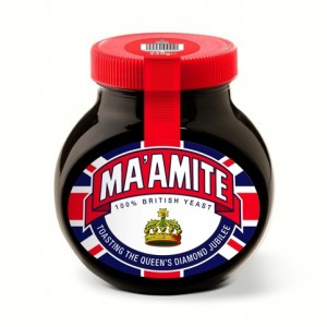
My absolute favourite example of Jubilee commemorative packaging. It's taking the humourous side of it all, appealing to it's customer base and celebrating the Queen's Diamond Jubilee in style. Although I think you'd have to be liverpudlian to pronounce the Ma'am in Ma'amite to address the Queen correctly. It's Ma'am as in ham apparently. Originating in the UK back in 1902 Marmite outdates the Queen by quite some years, so it's only right that they should acknowledge the celebration.
2. Mr Kipling - Great British Fancies
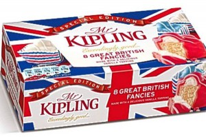
The concept is cute, pretty and considering the target market - highly attractive. With the garden party theme of the Jubilee celebrations what better product to celebrate with. I love the use of colouring in both the product and it's packaging and think it's a great example of how to stamp a Union Jack on your packaging and not look OTT. Soreen on the other hand don't quite have the same desired effect.
3. Innocent
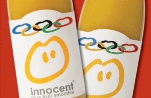
The first and potentially only good example of Olympic packaging. Thegreat thing about this use is how it has been integrated into the current logo design rather than just slapped onto the packaging. I also prefer the design and look of these olympic rings - it looks like an innocent design, compared to the 2012 official logo or the generic use of five coloured rings. Whilst Innocent's title of 'The official juice and smoothie partner of the London 2012 olympics' might be practically absurd the design itself is great.
4. Tate & Lyle Golden Syrup
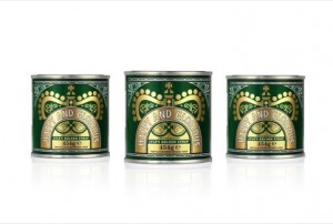
On first glance you might not necessarily notice the use of the crown in the logo design, or the words 'happy and glorious' as Tate & Lyle have kept to their own branding colours and style. This is tastefully done, in line with their own brand. As such a traditionally British product it's quite relevant and appropriate for the company to celebrate the jubilee and I think it's possibly the nicest, more subtle example.
5. Absolut
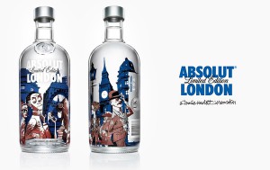
The Vodka brand is well-known for it's limited edition packaging. This design is quirky, very British but not too OTT. It's taken the red, white and blue colours but not necessarily used the normal tones. Subtle and a great balance in my opinion.
6. Marks and Spencer
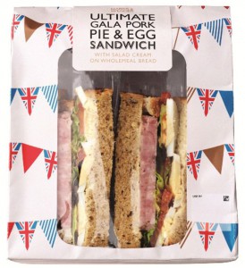
Marks and Spencer have quite a variety of branding activity to commemorate the year of 'Britishness'. My favourite use has been the new food range. Ideal considering the Garden party vibe and the packaging is great. Nice use of bunting and union jacks to signify the street party atmosphere, combined with typically British foods. Whilst this sandwich is in my opinion a horrific combination, others in the range are a lot more appealing and very fun; fresh cream and strawberry scones, fruit tarts, macaroons and other sandwiches such as Roast beef and yorkshire pudding - yes ... yorkshire pudding in a sandwich.
7. Vintage Packaging
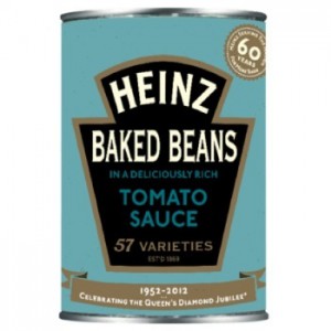
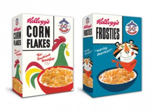
I've gathered these brands together as to best celebrate the Queen's 60 years on the throne, all 3 brands have gone back 60 years in their packaging. Very sweet, vintage and really appropriate considering the history and values of each company.
- Cadburys
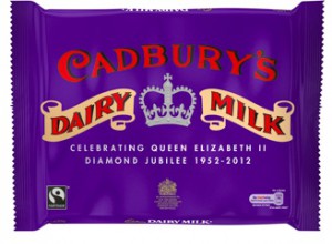
Poor examples in my opinion are KitKat who have simply chosen to change the first 'K' to a 'Br' - BritKat. Pretty lazy and not of much value. Lumix have also created a 2012 camera, it just has some pink dashes across the front and the most hated 2012 logo. Similarly to Charlie Brooker I have a real dislike for brands who have simply put the Olympic logo on their product, from McDonalds to toothpaste - it's all quite unnecessary and adds little value.
If there's any you think I've missed or some shocking examples you'd like to share... why not comment!
